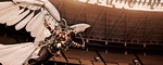
It doesn't look all that much like circus posters of the period, even if that's what it's trying to emulate.
Criterion & Eclipse Cover Art & Packaging Babble-on Vol. 7
-
soundchaser

- Leave Her to Beaver
- Joined: Sun Aug 28, 2016 12:32 am
Re: Criterion & Eclipse Cover Art & Packaging Babble-on Vol. 7
-
bearcuborg

- Joined: Fri Sep 14, 2007 2:30 am
- Location: Philadelphia via Chicago
Re: Criterion & Eclipse Cover Art & Packaging Babble-on Vol. 7
Looks like I’m in agreement with most here, Polyester and Local
Hero are great, Cluny isn’t-but I’m not a fan of The Circus cover either.
Seeing Vicki from Small Wonder made me fear that I’d have the theme song stuck in my head all day...
Hero are great, Cluny isn’t-but I’m not a fan of The Circus cover either.
Seeing Vicki from Small Wonder made me fear that I’d have the theme song stuck in my head all day...
-
danieltiger
- Joined: Tue Apr 15, 2014 8:48 pm
- Location: San Francisco, CA
- Contact:
-
Boosmahn

- Joined: Mon Sep 04, 2017 10:08 pm
Re: Criterion & Eclipse Cover Art & Packaging Babble-on Vol. 7
I love the color scheme of Local Hero, the phonebooth's red pops out so well. Polyester is good but not what I was expecting at all!
As for Cluny Blown, I don't hate it as much as some seem to, but it's certainly one of the year's worst. What is up with her arms?
As for Cluny Blown, I don't hate it as much as some seem to, but it's certainly one of the year's worst. What is up with her arms?
-
CSM126

- Joined: Thu Nov 04, 2004 8:22 am
- Location: The Room
- Contact:
Re: Criterion & Eclipse Cover Art & Packaging Babble-on Vol. 7
That Polyester cover is amazing. I was expecting/hoping for something similar to the laserdisc cover (gaudy leopard print fabric and obnoxious pink lettering), but what they came up with instead is simply fantastic.


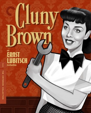


Cluny Brown looks like a B-grade movie about a cyborg maid. Sheesh.
-
Lowry_Sam

- Joined: Mon Jul 05, 2010 3:35 pm
- Location: San Francisco, CA
Re: 995 Polyester
No comments on the Polyester cover yet? I actually like it, but expect some will hate it.
-
CSM126
- Joined: Thu Nov 04, 2004 8:22 am
- Location: The Room
- Contact:
-
domino harvey

- Dot Com Dom
- Joined: Wed Jan 11, 2006 2:42 pm
Re: 995 Polyester
Anyone who hates that cover isn’t worth listening to about anything ever. From the art to the font, it’s a dead-on parody of countless paperback Romance novels of the 80s and 90s, and I wouldn’t be surprised if they hired someone who used to make real ones back in the day to paint it
-
Lowry_Sam
- Joined: Mon Jul 05, 2010 3:35 pm
- Location: San Francisco, CA
Re: Criterion & Eclipse Cover Art & Packaging Babble-on Vol. 7
It’s definitely the best of this month, with Local Hero 2nd, but I think some will want something in line with the original artwork or consistent with JW’s 2 previous releases. It’s too bad they didn’t have the two previous releases in different paperback styles.
-
Graphist

- Joined: Thu Jul 23, 2015 2:18 am
- Location: New York City
Criterion & Eclipse Cover Art & Packaging Babble-on Vol. 7
You know, I expected Polyester to be polyester and it is more like silk, and the finest kind you can get your hands on, honey!

About the Lubitsch film (that Lubitsch himself probably would’ve disowned after seeing the new art), I feel at this point even the original newsletter clue drawing with George Clooney’s huge bobbing head would’ve worked so much better as the cover art.

But I am more concerned about the jarring colors of The Circus. No! Why?! What did they do to my beloved Charlie?! In my head he always exists in the simpler, innocent dimensions of the bygone black and white world. Cut the circus, Criterion!

About the Lubitsch film (that Lubitsch himself probably would’ve disowned after seeing the new art), I feel at this point even the original newsletter clue drawing with George Clooney’s huge bobbing head would’ve worked so much better as the cover art.
But I am more concerned about the jarring colors of The Circus. No! Why?! What did they do to my beloved Charlie?! In my head he always exists in the simpler, innocent dimensions of the bygone black and white world. Cut the circus, Criterion!
-
Feego

- Joined: Thu Aug 16, 2007 7:30 pm
- Location: Texas
Re: Criterion & Eclipse Cover Art & Packaging Babble-on Vol. 7
At this point, Criterion really is just trolling us with their Chaplin and classic-movie-star caricature covers. But Polyester is gorgeous, and it calls to my mind not even a romance novel but a poster for a Ross Hunter-Douglas Sirk film, which is actually really appropriate. I hope this artist is recruited to do the inevitable Written on the Wind upgrade. About the only way it could possibly be improved is if Tab Hunter's shirt was being blown open.
-
Fiery Angel

- Joined: Sun Jan 11, 2009 1:59 pm
Re: Criterion & Eclipse Cover Art & Packaging Babble-on Vol. 7
Sad that the only good cover this month is the Bellocchio.
-
HitchcockLang

- Joined: Tue May 28, 2013 1:43 pm
Re: Criterion & Eclipse Cover Art & Packaging Babble-on Vol. 7
Yeah, I'm not in love with The Circus cover despite the love it's getting here. The colors seem harsh and garish (I feel like prolonged exposure would give me a headache) and I don't think Chaplin's name really needs to be on it twice, but I'm not a design guy so maybe I'm just wrong.
Total agreement about the horrendous Cluny Brown cover though so my taste can't be that questionable.
Total agreement about the horrendous Cluny Brown cover though so my taste can't be that questionable.
-
mteller
- Joined: Tue Nov 02, 2004 3:23 pm
Re: Criterion & Eclipse Cover Art & Packaging Babble-on Vol. 7
I would prefer it said John Waters's Polyester instead of John Waters' Polyester but I know style guides conflict on this issue.
-
dda1996a

- Joined: Tue Oct 27, 2015 6:14 am
Re: Criterion & Eclipse Cover Art & Packaging Babble-on Vol. 7
What? I may not be a born English speaker, but you never write s's.
-
mteller
- Joined: Tue Nov 02, 2004 3:23 pm
Re: Criterion & Eclipse Cover Art & Packaging Babble-on Vol. 7
Sorry to be lazy, but I'm sure no one wants a huge derail, so here's some links:
https://www.dailywritingtips.com/posses ... ding-in-s/
https://www.merriam-webster.com/words-a ... possessive
https://www.thepunctuationguide.com/apostrophe.html
https://www.dailywritingtips.com/posses ... ding-in-s/
https://www.merriam-webster.com/words-a ... possessive
https://www.thepunctuationguide.com/apostrophe.html
-
zedz

- Joined: Sun Nov 07, 2004 7:24 pm
Re: Criterion & Eclipse Cover Art & Packaging Babble-on Vol. 7
In terms of graphic design, they should go with the one that looks less freakish- single s.
-
Glowingwabbit
- Joined: Wed May 01, 2013 1:27 pm
Re: Criterion & Eclipse Cover Art & Packaging Babble-on Vol. 7
I know it's allowed, but it looks terrible from an aesthetic point of view imo. I'm also biased as both my first and last name end in "s" and I shutter anytime I see someone doing that.
-
FlickeringWindow
- Joined: Fri Nov 15, 2013 12:27 pm
Re: Criterion & Eclipse Cover Art & Packaging Babble-on Vol. 7
The original poster says "John Waters' Polyester"
-
mteller
- Joined: Tue Nov 02, 2004 3:23 pm
Re: Criterion & Eclipse Cover Art & Packaging Babble-on Vol. 7
...and I just noticed they did the same thing on Female Trouble. Eh, not a hill I need to die on.
-
Brian C

- I hate to be That Pedantic Guy but...
- Joined: Wed Sep 16, 2009 11:58 am
- Location: Chicago, IL
Criterion & Eclipse Cover Art & Packaging Babble-on Vol. 7
Interesting. I would think that the first-name possessive would always be apostrophe-s: Chris’s, Gus’s, Charles’s, Jesus’s, etc. That’s certainly what I would say out loud.Glowingwabbit wrote:I know it's allowed, but it looks terrible from an aesthetic point of view imo. I'm also biased as both my first and last name end in "s" and I shutter anytime I see someone doing that.
But last names are different. I wouldn’t say “John Waters’s Polyester” so I guess I’m not sure why people would write it that way (even though honestly I usually do myself).
-
Boosmahn
- Joined: Mon Sep 04, 2017 10:08 pm
-
zedz
- Joined: Sun Nov 07, 2004 7:24 pm
Re: Criterion & Eclipse Cover Art & Packaging Babble-on Vol. 7
I don't think that's a first name / last name distinction, I think it's just down to the linguistic accident that "water" is a regular noun, so that "Waters" sounds like a regular possessive. Whereas we don't recognize krih, guh or charl as words or names, water makes sense and Waters' sounds like a possessive even without pronouncing the second s. (cf. "Herbert Ross' Polyester")Brian C wrote: ↑Wed Jun 19, 2019 7:17 pmInteresting. I would think that the first-name possessive would always be apostrophe-s: Chris’s, Gus’s, Charles’s, Jesus’s, etc. That’s certainly what I would say out loud.Glowingwabbit wrote:I know it's allowed, but it looks terrible from an aesthetic point of view imo. I'm also biased as both my first and last name end in "s" and I shutter anytime I see someone doing that.
But last names are different. I wouldn’t say “John Waters’s Polyester” so I guess I’m not sure why people would write it that way (even though honestly I usually do myself).
However, it's kind of wrong. I always avoid the double 's' with possessives in writing, because it looks inelegant, but I generally pronounce it as a double 's', because you need to do that for clarity from the non-possessive form, which would otherwise sound identical. So technically, and for clarity, you should also be pronouncing two esses in Waters' in this context, so everybody knows that you're talking about a movie he made and not fabric printed with his face all over it.
-
swo17

- Bloodthirsty Butcher
- Joined: Tue Apr 15, 2008 10:25 am
- Location: SLC, UT
Re: Criterion & Eclipse Cover Art & Packaging Babble-on Vol. 7
I don't know where I stand on this grammatical issue and it's bothering me more than it should
-
cdnchris

- Site Admin
- Joined: Tue Nov 02, 2004 2:45 pm
- Location: Washington
- Contact:
Re: Criterion & Eclipse Cover Art & Packaging Babble-on Vol. 7
I HATE when I see "Chris's." It irked me just typing that.